 480aa406bb
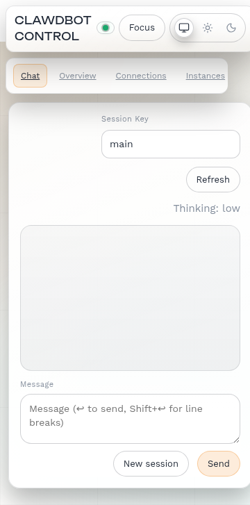
- Add @media (max-width: 600px) breakpoint for mobile-specific styles
- Compact header: smaller title, hidden subtitle, minimal status pill
- Horizontal scrollable nav: all items in one row, swipeable
- Hide redundant page titles on mobile
- Hide docs button on mobile (saves space)
- Smaller theme toggle icons
- Tighter spacing on cards, stats, forms
- Better chat layout: full-width session selector, compact compose
- Single-column log entries on small screens

Desktop layout remains unchanged.

Co-authored-by: Carl Ulsoe <34673973+carlulsoe@users.noreply.github.com>
105 KiB
360x727px
105 KiB
360x727px